Point and click game My role: Brainstorming, sketching, design, copywriting, social media grid, presentation for the clients, scheduling of posts and motion graphics.
PUPILA DILATADA
Branding
Challenge
Design a logo that stands out from the competitive world of audiovisual production. It should convey professionalism, freshness, and quality. Signaling dedication to the craft and promising an innovative and unique service.
Result
Pupila dilatada is a production company coming from a group of art-loving friends, carving their way in Mexico's contemporary scene. They convey original and innovative ideas through visual storytelling, whether it’s for personal passion projects or professional endeavors.
BRIEFING
I started by sending a google form questionnaire to the client to define the core details of the project. We included goals, scope and strategy. This helped me acknowledge the virtues and constraints for the project. After a meeting with the client to set clear their vision I made a competitive analysis to evaluate the company’s position and develop a unique brand. I also found convenient to develop a user persona in order to define who is the target audience and thus always keep in mind who i'm designing for.
BRAINSTORMING
I relied on the "Lotus flower" brainstorming tool so I could have diverse and concrete ideas.
SKETCHES
I searched for visual inspiration on various sources (such as pinterest, books and online design archives). I started sketching and refining the best ideas so we could have a better idea on what the finished logo would look like.
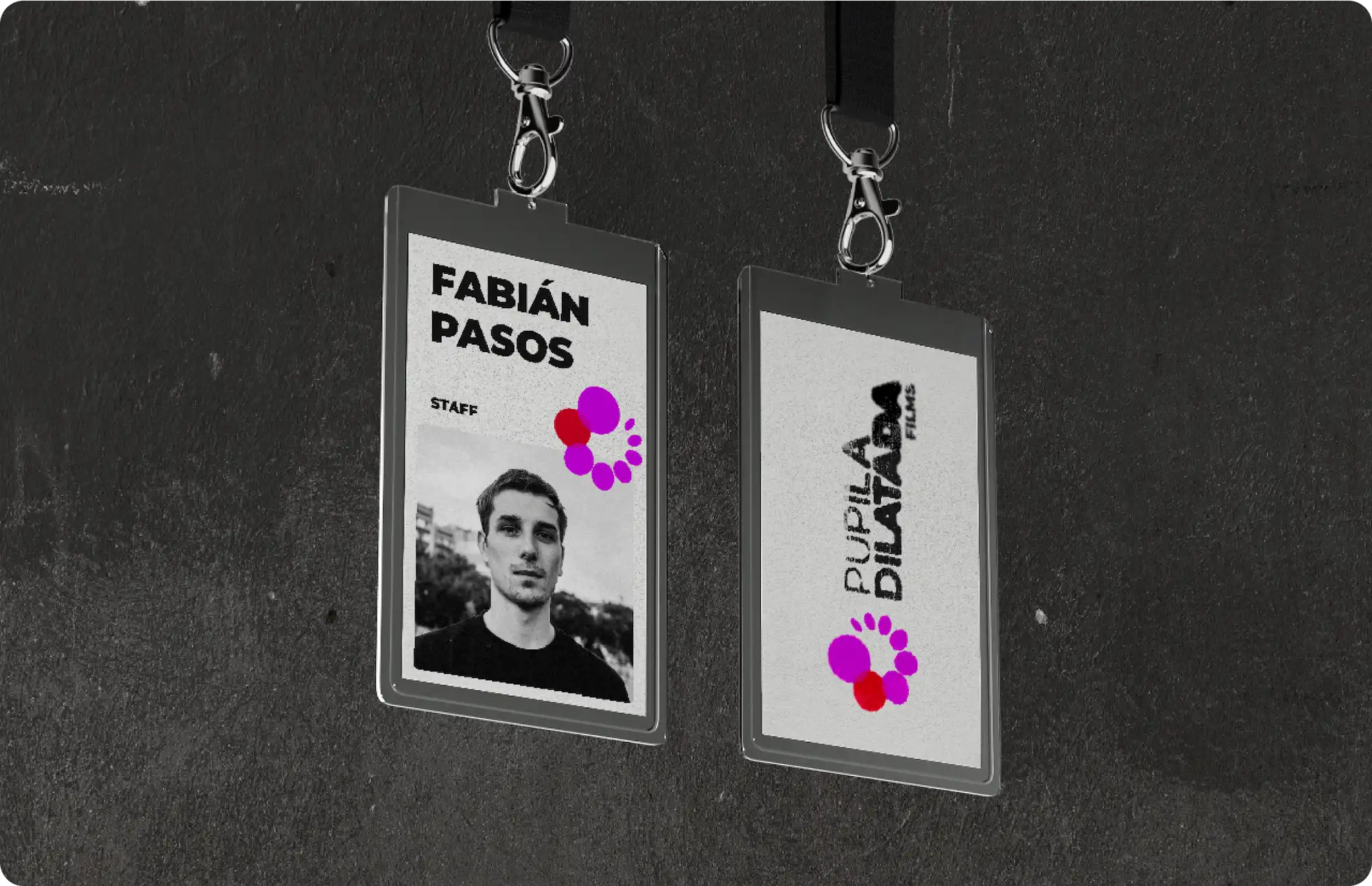
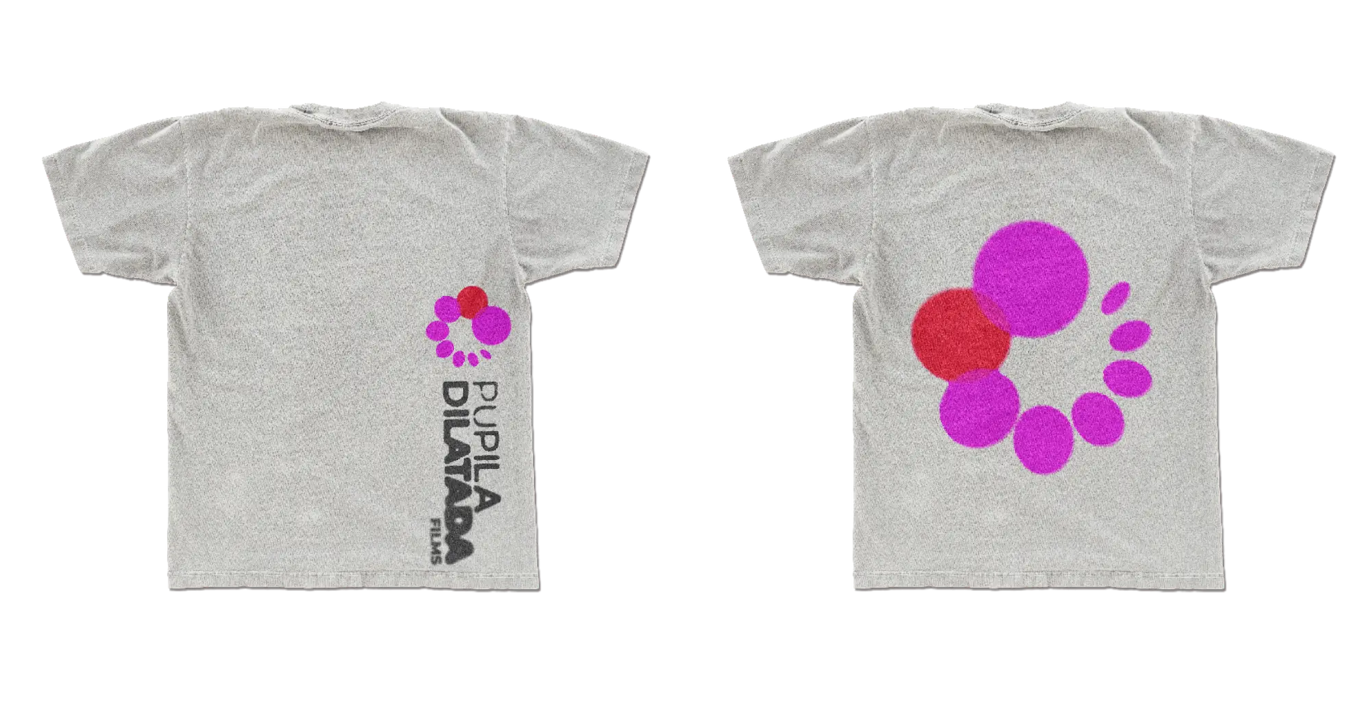
THE LOGO
The icon transmits movement and creates the illusion of being in rotation, starting with a small oval that expands until it ends in a large circle. It represents the pupil and at the same time a roll of film because of the changes in dilations and the general form. The same playful changes occur in the typography that celebrates imperfection and the experimental. The organic yet solid shapes represent the creative, unconventional and strong nature of Pupila Dilatada.
COLOR
Magenta symbolizes the fusion of extremes, reflecting the production company's originality and innovation. Resulting from a blend of violet and red light, it represents the harmonious integration of diverse ideas beyond conventions. Red signifies professionalism, it is a universal color largely used in cinema to convey a variety of emotions and meanings, while black evoques strength and dignity.
LAS ACUARELAS DE AMELIA
Interactive ebook for children My role: Design strategy, problem solving, character design, illustration, animation, programming.
Challenge
Craft an interactive ebook using Adobe animate. Targeted at children between 4 and 7 years old with playful and educational concepts such as getting to know the numbers, alphabet, numbers, etc… serving an original story with original characters, scenarios, etc. For the derivable, we had to create: - The home screen - A welcome screen with the instructions - 6 scenarios with - 3 interactive objects - The final screen with the moral of the story
Result
Acuarelas de Amelia: A short, animated children’s story designed with lots of love for all the young, creative and curious souls.The story follows Amelia as she discovers new emotions while managing her feelings with kindness; remembering that everyone’s emotions are valid and deserve to be listened to.
THE CONCEPT
We started sharing every type of theme that could make a good lesson for our story. We concluded that often, as kids, it is difficult to be specific about how we’re feeling, and focus on it for our story. We fully wrote out our original story and once we were done with it, we tasked ourselves with the storyboarding phase.
DESIGN
We moved on creating the final illustrations along with the animations. The most interesting part of the project was making the interactive buttons for each screen, I’d never used that tool, and didn’t expect there to be so many options, that helped in making the project feel more cohesive.
TESTING AND CONCLUSION
When all the parts were put together it was time to launch the app and test it, through some iterations we ended with the final result. This project was interesting because you really had to put in the shoes of the user: the children and the parents. Because of this we had to think of every little detail in order to succeed, and I think it’s always fun to design something that is interactive because you have to make sure that everything works well and everything is in place. All that necessary effort makes seeing the result much more rewarding.
PECES DE TIERRA
VR loop animation My role: Sketching, Quill illustration, animation.
Challenge
Using a VR headset to make an illustration on Quill, it needed to include characters, a realized scenario and a little bit of animation, based on our concept and design.
Result
“Peces de tierra” is a vibrant underwater scenario where you immerse yourself through VR. You can observe a variety of sea creatures as they move.
THE CONCEPT
We began tossing ideas to determine the theme of our illustration. Searching inspiration from dream-like, sea-inspired animated movies, we were drawn to the enchanting world of the animated movie “Ponyo”. We developed a mood board filled with references for our sketches. We put our pencils to work refining our ideas into a final concept art.
VR PROCESS
We put on the VR goggles and ventured into Quill to begin the rough sculpt. With a solid sketch in place, it was about time to start the process of crafting the illustration itself. Despite the challenges, this phase was rewarding and very enjoyable, as each stroke and detail was meaningful as it brought us closer to our final vision. We took turns among team members, ensuring that the creative energy remained. We later began animating the sea animals and their environment. This final step added life to the illustration, inviting viewers to become fully immersed in the magical world of “Peces de Tierra”.
CONCLUSION
The biggest challenge came with learning a whole new program, you had to think with a 3D mindset while being inside your own illustration, having experience with Maya and Z-brush beforehand helped in further understanding. We used all the possibilities and tools that we had to our advantage, I enjoyed this project very much and took much from that experience.
MI JARDINERO VIRTUAL
Plant care app My role: Design strategy, problem solving, user persona, empathy mapping, user flow, wireframing, visual design, prototyping, usability testing.
Challenge
Create a hi-fi prototype for an app following the UX/UI principles that solves a common problem that we observed in our region.
Result
Mi Jardinero Virtual works as a virtual assistant that will offer you advice, information and tools to have the best knowledge about what plants are best suited for the region and how to take care of them, but if you already have plants there is no worries because you can also receive the same tools and information to give the best care to them.
DISCOVER PHASE
We interviewed 5 people of the region around 20 to 40 years old interested in nature, mostly on flora, that were creative, calm and responsible with their environment. We worked with the next questions:
Qualitative research
- What is your age? - Do you worry about the environment? - Do you consider yourself a “plant lover”? - Usually, Where do you get your plants? - Yearly how many plants do you get? approximately - What do you look for when buying a new plant? - Do you know exactly how to take care of each one of your plants? (watering, reproduction, nutrition, etc) - Do you know what the native plants of your region are? - Would you use an app that guides you on how to take care of your plants and what to look for when buying new plants in a friendly way without using invasive species? - Do you find it difficult to take care of plants? If so, what kind of problems do you have? - Do you find it necessary to know the native species of your region? - Does your house have a garden? - What do you prefer, indoor or outdoor plants? - How many time do you have in a day to take care of your plants? - Would you use an app that allows you to create the perfect garden? - How much money would you be willing to spend on Mi Jardinero Virtual Premium? - Do you prefer paying once or monthly?
Interview insights
- Nowadays everyone is concerned for the environment. - People tend to get plants that are easy to take care of. - Is no a common knowledge what plants are native of a region. - It’s difficult to know what are the specific necessities of a plant without a guide. - Because of the previous point, the majority of the acquired plants easily die. - It’s important to know the native plants of your region. - Indoor plants are more popular than outdoor plants.
Quantitative research
Do you worry about the environment?
Usually, Where do you get your plants?
What do you look for when buying a new plant?
Do you know what the native plants of your region are?
Do you find it necessary to know the native species of your region?
Would you use an app that allows you to create the perfect garden?
Brainstorming
Based on the user interview and online survey we sat down to start brainstorming about all the tools we could offer on the app.
DEFINE PHASE
With all the data given to us from the interviews and survey, we created a persona representing a potential user of the app. This would help us to have a better understanding of the user's goals and personality.
User persona
Empathy mapping
We made this map in order to define the target audience with more clarity, this helped us to understand their needs and actions.
IDEATE PHASE
This step was done to categorize all the features under different sections.
Card sorting
DESIGN PHASE
Before we jumped into xd, we had to do a prototype on paper to get an idea on how the app would work and to start structuring the app's flow. This part was important in order to make early changes and adjustments.
Lo-fi prototype
The elements
Knowing which elements were necessary so the app would look good, we opened illustrator and started designing all of them.
Hi-fi prototype
After having a more concrete idea, it was time to upgrade the design to something more refined approaching the end result.
TEST PHASE
For our final exam we had to present our pitch in front of the class and then the professor would choose random classmates to test our prototype. We ran an unmoderated usability test and did some questions in order to obtain insights.
Usability testing
Findings
The navigation and app flow was easy to follow for the user When adding a plant to the wishlist, some users found it hard to find the button. We added fill and a dropdown shadow to it.
PERSONAL PROJECTS
Posters, illustrations, photography, etc.
Here you can find the work I create when I have the time to experiment and test new tools, ideas, concepts, etc.


.webp)


.webp)
.webp)
.webp)
.webp)


.webp)
.webp)
.webp)
.webp)
.webp)
%2014.51.50.webp)


.webp)


